
The Code as a Crime Scene Gallery
by Adam Tornhill, May 2015
I've worked with the techniques and strategies that became Code as a Crime Scene for several years now. I developed my tools and techniques as responses to challenges in the projects I worked on. I also tested the tools on a lot of open source projects.
Unfortunately I cannot share some of the coolest findings I made since those are from proprietary systems. However, I'd like to present a gallery, something like a best of, from the open source analyses. I hope you enjoy it as an introduction to some different ways to visualize the multi-faceted socio-technical environment we call large scale software development.
The Hotspots in Mono
Our first entry is the Mono project. Mono is an implementation of Microsoft's .NET framework. It's a large codebase, around 5 million lines of code, and written in multiple languages (C and C#). Mono is a good candidate to start with since it allows us to show the power of language neutral analyses and visualizations.
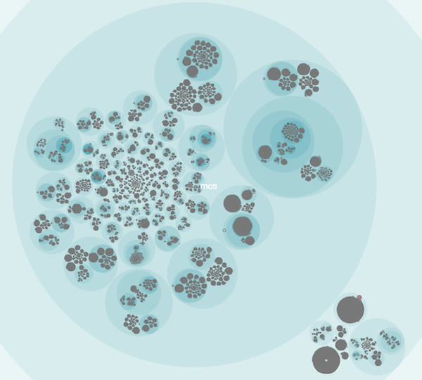
So that's what five million lines of code look like.
The real hotspot visualization is interactive. That means we can zoom in to the parts of interest. Here's what some hotspots (i.e. an overlap between complicated code that we have to work with often) in Mono look like:
Hotspots in Hibernate
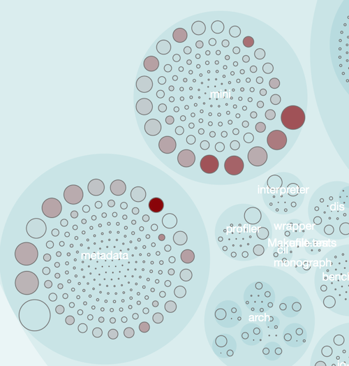
Hibernate is another codebase that I've analyzed a lot. It's a popular open source framework with lots of development activity, new features and growth. That makes it a nice case study.
Here's a high-level overview of the complete source that gives us the distribution and location of the main hotspots in the code:
Multiple Developers in Clojure
Many software projects are of course developed by multiple programmers. That's something we can analyze as well.
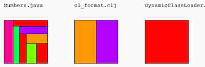
This visualization is called fractal figures. Each programmer is assigned a color and each module represented as a box. The area allocated to each color shows how much the corresponding programmer has contributed to the code over the past year.
Sure, you need the color legend to make full sense of it. But I find the visualization useful even without the legend since it's an easy way to spot modules that suffer from excess parallel development, which is correlated with bugs and quality issues.
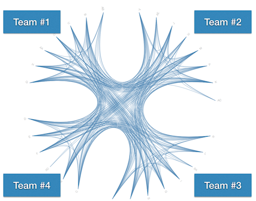
Know your ideal Communication Paths
We've known since the dawn of time, or at least since the 70's when Fred Brooks wrote The Mythical Man-Month, that communication overhead kills a software project.
Real communication is notoriously hard to measure since there are so many aspects of it (verbal, non-verbal, written, etc). What we can do however is to measure the ideal communication paths based on how the software was grown.
What you don't want to find, is an organization where everyone must coordinate with everyone else. But sometimes we end-up there because our software architecture just cannot support all developers we throw at the code. Here's one such situation taken from a project that wishes to remain anonymous:
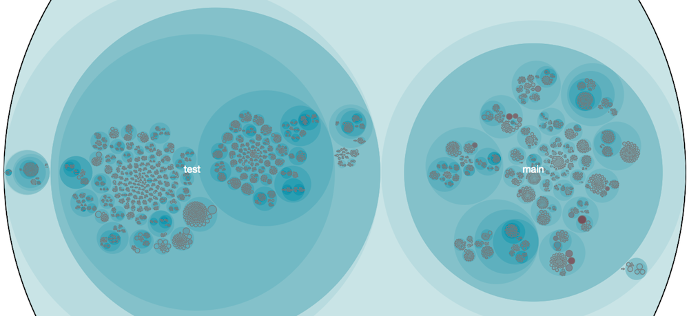
Knowledge distribution in Scala
One of the main challenges of communication is to know who to communicate with in the first place. Who may help you debug that nasty null reference? Who's the best to review your proposed changes and who should you ask for advice if you want to dive into that elegant request broker?
A knowledge map answers those questions. We use the same principle as we did for the fractal figures above where each developer is assigned a color. The difference is that we show the whole system at once and only highlight the main developer of each module. Here's what it looks like in the Scala compiler:
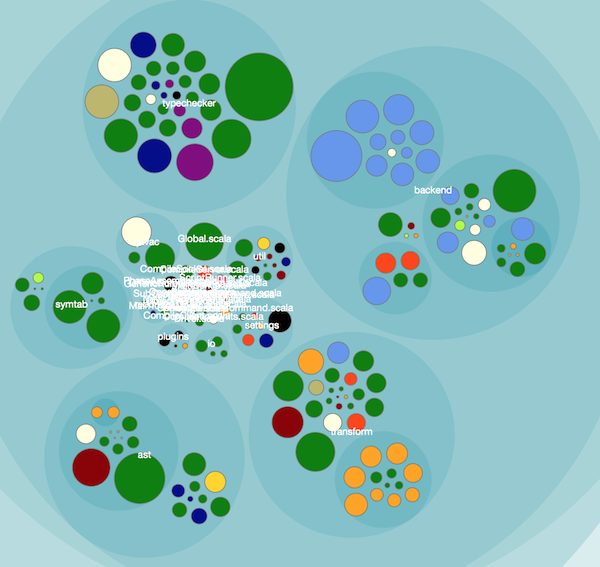
Once you start to map out knowledge, you have a bunch of cool applications at your fingertips. One of my favourites is to aggregate the knowledge on team level. Another application is to identify code that's written by a programmer who's no longer in the project or company.
Check out my article on Meet the Social Side of Your Codebase if you want to dive into some of these applications.
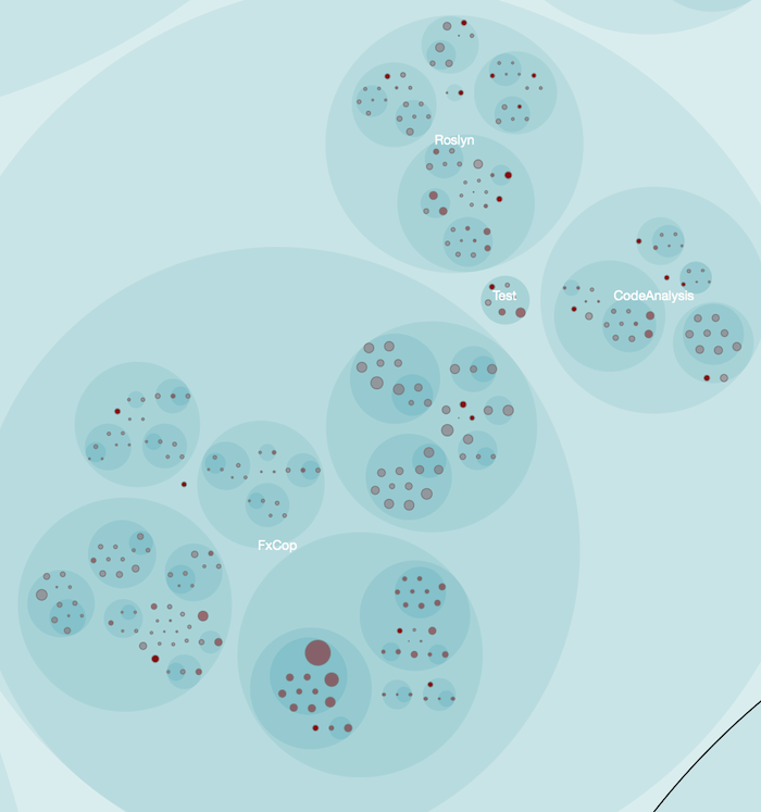
The Exponential Decay of Knowledge
Once we've finished a task we move on to solve new problems. After all, as Lehman's Laws observe, software has to continually adapt or it becomes less useful over time.
A consequence is that we soon forget details about the code we wrote. And that knowledge loss is rapid. That's why I've been experimenting with methods to highlight the age of code. The older the code, the less working knowledge do we have of its interiors.
I chose to model code age using exponential decay. The picture below shows the code age in the .NET compiler platform Roslyn using a half-life of two weeks. The more intense the red color, the younger that code. Note that this analysis was done just before the initial release of Roslyn, which is why there's a lot of activity.
Towards Evolutionary Beauty
I hope you've enjoyed the gallery - who said that legacy code isn't beautiful? - even though we've only seen as small sample of the possible analyses and visualizations. I do plan to extend it over time - I've got a lot of samples.
Before I leave you, I just want to note that when software is visualized as a whole, it's so obvious that code grows organically. It's the nature of software systems and a fact we need to embrace and master if we want to write good code.
Make sure to check out my new book, Your Code as a Crime Scene in case you want to dive into these techniques, learn their strengths, limitations and use cases.